By Paul Whitby
In the first article of this three part series on aquascaping, I discussed some of the simple rules of thumb that can be applied to the design of the rock structure that will help you develop a natural looking vista. For the most part, these were based on simple aesthetic principles utilized in other visual arts, such as minimalism, composition and negative space. The application of the Golden Rule introduced a more scientific based element to this decision process. In this installment of the series, I wish to expand upon these basic principles and introduce two other key parts of the scaping process. The first involves a technique used by many in visual 3D designs, that being Forced Perspective, while the second is a very old scientific principle developed in the 1600s and revolves around Color Theory. The application of forced perspective rounds out the decision making process of where to place and arrange our rock structures while color theory moves us into the realm of dressing our rock structures with corals.
1. Forced Perspective
Forced perspective is a technique that once again employs an optical illusion to make something appear artificially altered in size or location. In essence, it’s a technique we can use to make our rock structure appear artificially larger than it really is. Similar to the application of the Golden Rule, forced perspective is a visual technique commonly used in landscaping, architecture and art and is easy to apply to our smaller 3 dimensional structures. As we all know, an object far away looks smaller than the same object up close. By bringing the far away object closer, but making it smaller and viewing from the same place, the illusion of depth and distance is maintained but in a much smaller area. This is the most common application used in aquascaping. To better describe this, let’s look at a few examples in architecture and landscaping, which very much reflect the principles we use in aquascaping.
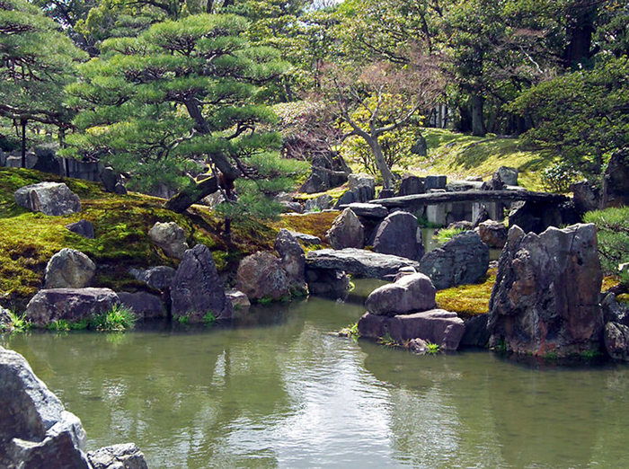
Probably the undisputed master of forced perspective is Disney. Whenever a Disney park is mentioned the image of the towering castle comes to mind, however the reality of the castle is very much different from our perceived image. Disney uses forced perspective in numerous subltle ways. In the photograph of the main street the Castle can be seen in the distance, but in reality it is much closer. To achieve this effect the ground slopes upwards and the buildings get slowly smaller the nearer they are to the castle. In addition, the street also becomes narrower. All of this serves to create the illusion of depth. In the Japanese water garden the rocks in the foreground are larger than those behind, as are the trees and the shrubs. Also note that the pool narrows to the back and that the stream runs away at an angle. All of which emphasizes, or forces, the perspective.
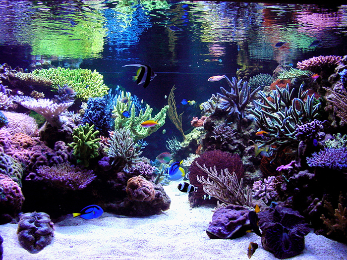
So, given the above examples, how do we apply this to a much smaller enclosed space. The easiest and most common application comes from the use of gullys, or valleys in the rock structure. In part one, I discussed the use of gullys as negative space and the positioning of them to fulfill the golden rule. If a break in the rock is used, it can be made to follow forced perspective by making the back of the gulley narrower than the front of the gap. In this way the break appears to go back farther than it actually does. Another technique is to make the valley at a slight angle, this again emphasizes depth. One can also enhance this by making the height of the rock work at the back smaller than at the front. This would however make for a very odd looking structure, so to achieve the same effect, build the rockwork and then slope the sand bed upwards towards the back. The net result is a smaller height of rock that can be seen, but a very much improved illusion of depth. This is possibly the only aquascaping technique that requires attention over time as the sand will slowly settle to a flat bed, and would need to be pushed back every so often to keep this illusion. In smaller tanks the use of forced perspective can be difficult to apply due to the lack of space. A simple way around this problem is to make any valleys run at a slight angle away from the front. Bear in mind the issue of refraction (discussed in part one of this series) will increase the apparent angle of the valley, and angle both sides, not just one, to create the illusion of narrowing. This will ultimately have two impacts. One will be the addition of apparent depth due to forced perspective and the other will be an interactive component in that the observer is likely to move themselves and their viewing angle to allow them to better observe the valley. This has a psychological component of making the viewer perceive the tank as physically larger. In the tanks that I aquascape, I always use angled gullys to create interest and build forced perspective. In the examples shown below, Steve Weast has utilized forced perspective to make the valley between the rock look longer than it actually is. While Steve’s tank is large already, the illusion it creates is that of a much more massive structure.
2. Color Theory
Color theory is very much a blend of science and aesthetics and essentially describes which colors look best when juxtaposed against one another. The basics of the theory were described by Sir Isaac Newton (Ca.1642-1727) who discovered that when sunlight passes through a prism, the individual colors of the spectrum could be observed. In doing so Newton was the first to understand that sunlight was indeed a blend of lots of different colors which our eyes perceive as white. Newton described the individual colors as being “perceptual” rather than physical. By this he meant that we see different colors and that color is an interpretation by our senses rather than a physical property of the lights wavelength. In doing so he essentially described how eyes work, although those discoveries came several centuries later. Irrespective of this, Newton went on to make a major leap in the understanding of light, and vision, when he realized that the linear spectrum could be folded into a circle and that every known color could be found on that circle by blending those on either side of it. This simple tool has since become known as the color wheel, a tool used throughout modern history in art, design and graphics. An examination of the color wheel shows some interesting features that we can capitalize upon to increase the visual impact of our aquascaping. The first key feature is that the primary colors red, blue and yellow form an equilateral triangle. All other colors are a blend of these three primary colors. These are also the three color receptors of the human eye and, likewise, we perceive colors as a blend of the signal from the three receptors. Another feature of the wheel is that complimentary colors are directly opposite on the color wheel. An interesting property of complimentary colors is that they appear artificially brighter when adjacent to each other. So, as a person wanting the best aquascape- what does all this mean to us and how can we use this information ? The simplest application is that of “complimentary colors”. Since our structures are 3 dimensional, there will be many situations where two corals sit next to, or one in front of the other. In this case it is best to choose complimentary colors to enhance the visual effect. The simplest way to do this is to choose a coral that you particularly like as the main focus coral and then choose any other coral that has a complimentary color to bracket, or frame it. An example of a focus coral would be a rose millepora which has a deep pink red color. Using the color wheel, we can see that directly opposite red/pink is green. So, for maximal effect a green complimentary coral is required, such as an Acropora yongeii (green slimer) or an A. abroholsensis- or indeed any other green coral. The focus coral is then placed in the prime location for viewing (following our 5:3 rule of course) and the complimentary coral placed adjacent or behind the focus specimen (see images below). When doing this, bear in mind that we are planning on the future look of the corals and to give them space to grow and colonize that area. This simple technique can be applied to any coral and will make a nice specimen truly outstanding in our tanks.
In nano systems we can go one step further and stock the system with self complimentary corals. A prime example of this would be The Superman montipora, a pink body with blue polyps- while not truly complimentary, the colors are very close to a true diagonal across the wheel, and really stand out against each other. Sunset montipora is another example, but any mushrooms, ricordia or zoanthids exhibiting self complimentarily will really stand out in this smaller environment.
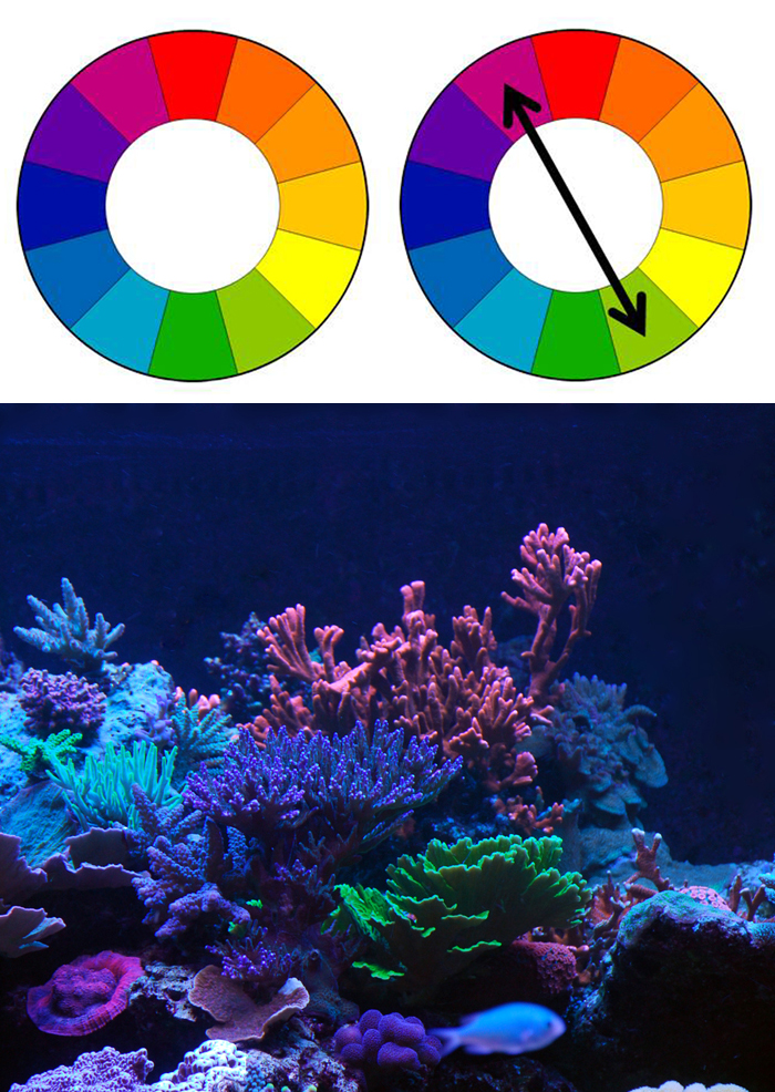
In these examples the Color Wheel of Sir Isaac Newton is shown. From this the complimentary colors of Red and Green can be seen as a diagonal across the wheel. In the last panel a Rose Millipora is bracketed by a green Acropora. Note how the green helps highlight the pink, yet the blue coral to the side appears washed out.
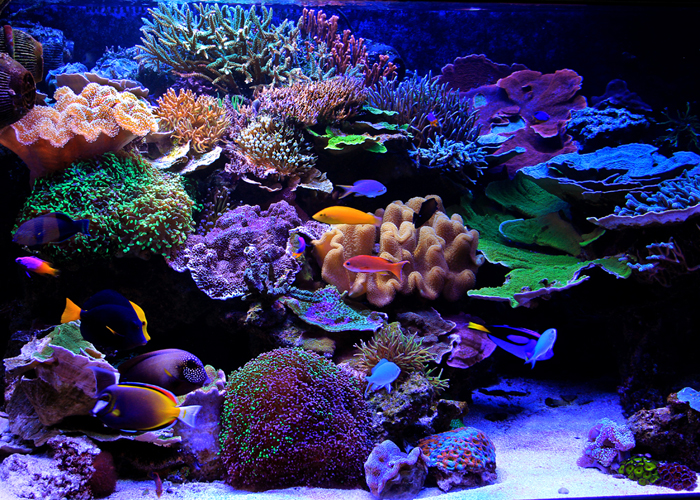
Since our tanks, and our aquascape structures, are 3 dimensional, chances are that we will have many corals in a single area and as such the principle of complimentary colors cannot be easily applied. In this scenario, to maximize the visual impact we can apply the principle of harmonic triads. In this the application, the colors at the points of an equilateral triangle are chosen for use as opposed to two directly opposite colors. For example, the primary colors red, blue and yellow make a harmonic triad, as do the secondary colors (secondary colors are found equidistant between the primary colors and are purple, green and orange). By drawing an imaginary triangle on the color wheel and rotating it, all of the harmonic triads can be found. When applying this use it is easiest to choose the specimen, or focus, coral that we desire the most- in the example below, this is a purple acropora. Then, look to the color wheel, mark the purple color and use this as one point of the triangle and find the other two colors to create the harmonic triad. In this example they are orange and green. To build the best arrangement use the focus coral at front and bracket it with the other two corals, once again allowing space for the corals to grow. At this point it is important to mention variety of structure as well as color, and use different corals to create and appealing picture. In the example shown, I have a purple A. valida in front of an orange Montipora digitata and outlined by a lime green Montipora capricornis. From experience I know that the orange digitata will grow upwards, more than out, the valida will form a globe of small branches while the capricornis will plate, so that none of the corals will grow through or over each other for several years. Although this is a single example, the tank I have shown in part one of this series and in several pictures in this installment, was built using the theory of harmonic triads. The corals in the tank are not particularly “collector’s items” or “limited editions” but were chosen primarily based on color and growth pattern, representing a secondary benefit of the use of the color wheel. By choosing corals based on these attributes, as opposed to “named” or “limited edition” corals we can make a very beautiful structure with commercially cheaper corals. For those “must have pieces”, the color wheel shows us how to best display these pieces to maximal effect.

On the color wheel the purple color of the Acropora valida is chosen as one point of an equilateral triangle. The other points lie close to orange and green. Corals with these colors were chosen to bracket the focus coral. In this skillfully created example of the use of Harmonic Triads, Steve Weast has built a vibrant aquascape based upon coral placement and visual impact.
With the inclusion of forced perspective, the range of decision making aspects of aquascaping are completed. Together with the other principles discussed in the first part of this series you are now armed with a range of tools you can employ to plan out your rock layout before you start adding rock to the tank. My personal advice is to play with these concepts until you feel confident with their application and that they will provide you with the result you seek. In doing so you will help to solidify the idea you have in your head for how your tank should look. Chances are that this will be completely different to how I would do it, and that is the beauty of the above mentioned principles. They are merely guides, not absolutes. You should feel free to choose which to use, or discard them all, but the principles still remain. With the introduction of color theory you now have access to a very simple decision making process to highlight the corals in your tank. To my mind, color theory is one of the most powerful tools we can use and by doing so it will help you create an image of stunning colors when the tank is viewed as a whole, as well as highlighting specific corals when only sections of the system are observed.
In the final installment of this series I will detail some of the physical aspects and techniques of structure building. This will include the use of PVC sub frames, drilling and pegging rock, the use of zip ties and how to build arches and pillars and will discuss water flow in the context of tank design.
Photo credits: Japanese water garden from : http://helpfulhintsblog.com/make-you…ed-perspective
Disney Images from: http://bgavideo.wordpress.com/2008/1…d-perspective/




0 Comments