Ever wonder what the current state of the ocean reef around the world is?
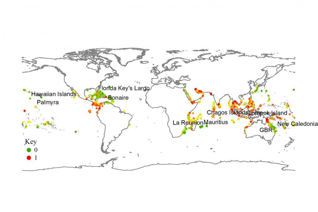
Here’s a nifty map that shows in various levels.
Green, yellow and orange indicates that there’s still hope if we reduce damages caused by humans. These areas were determined to be most capable of handling the “stress” even if the expected temperature of the ocean are to rise in the future.
Areas marked with red dots were determined to be too late to save, already barren and void of any self-sustaining possibilities if the ocean’s temperatures were to rise.


0 Comments