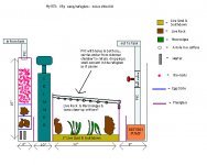
I have revised the sump/refugium that I posted here a few days. I got some very good feedback on the last one and was hoping for the same kind of response this time. The same basic theory applies to this design as with the last. The major changes come in the form of some added baffles and a lower water line to accomodate a power outage. There are now two added baffles... the first, in the skimmer chamber, is to serve as a detritus collection point. The second added baffle is located in the return pump chamber. It allows the bubbles from the water cascading out of the refugium to surface and pop before the water is returned back to the main tank. Another noteable change is the use of bio-balls AND live rock in the entry chamber. Previously I had planned on using only live rock. After a little research and some advice from well informed individuals I have decided that only submerged live rock will be beneficial and have decided to go with bio-balls above the water line and live rock below it. I also removed the sponge as it will only hinder the water flow and is a pain to keep clean/replace. Also, I had previously intended to use a sheet of plexiglass as a "roof" over the refugium. This roof has some small holes in it to allow a small amount of water into the refugium as the majority of it bypassed the 'fuge and went straight into the return pump area. That "roof" has now been replaced with three 1" PVC pipes. I have put bulkheads at the desired water level in the plexiglass that separates the skimmer chamber and refugium and installed the pipes there... they angle down and rest on the top of the plexiglass wall at the other end of the refugium. There are holes drilled in the bottom of the PVC to allow a small amount of water into the refugium... same principal as the original idea, only this will be much easier to clean and will allow more light to reach directly into the refugium. My previous design can be seen at a post called "Please critique my DIY sump/refugium diagram" The new design is attatched below. Please share any comments or concerns you have about this design. I am always looking for ways to improve this. Thank you very much for your help, and I apologize for the lengthy post. Sorry.
Gray
Gray


