• Why not take a moment to introduce yourself to our members?

mkirda

Advanced Reefer
Rating - 0%
0   0   0
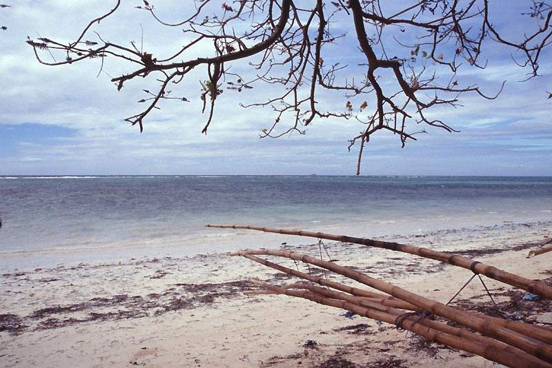
While scanning shots for an article, I came across this particular one.

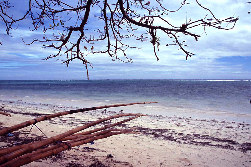
I took this back in January, this one as a sort of art shot.

The bamboo is being bent for outriggers, but the lines it formed, combined with the sea and the tree branches caught my eye. I only took one exposure.
I'm sure it was on a tripod.

It breaks several compositional rules. I'm still trying to decide if I like the results...

Enjoy.
Mike Kirda
 

Attachments

  • bendingbamboo.jpg
    bendingbamboo.jpg
    102.2 KB · Views: 588

investigator1

Advanced Reefer
Rating - 0%
0   0   0
It would be a great picture for a magazine ad for jamaica or something. But as far as "critique" goes the picture makes your eyes lead to the middle which is the horizon. Which would be great but there is nothing going on except windy water a long ways away.
 

azcaddman

Experienced Reefer
Rating - 0%
0   0   0
you might try something as simple as mirroring the image, to put the bamboo into the lower right corner.

Art
 

Attachments

  • bendingbamboo-flip.jpg
    bendingbamboo-flip.jpg
    76.4 KB · Views: 566
A

Anonymous

Guest
Rating - 0%
0   0   0
It might break "rules" but then again, real art always does... I think as a whole, it comes together quite well. I would leave it as is and forego the flippage, but if you simply must tweak it, I would start playing with the contrast. But that's only if you must. I think it's fine as is.
 
A

Anonymous

Guest
Rating - 0%
0   0   0
Here's another version that I quickly photoshopped. Basically what I did was...

1. Adjusted the levels and compressed them a bit
2. Increased overall brightness and contrast just a hair
3. Increased blue to shadows
4. Decreased green to mid levels
5. Increased blue to highlights
6. Increased saturation a little bit

I think it's fine as-is. When I work my own photos, I tend to go for a deeper look that ends up being more saturated and more contrasty. ::shrug:: just a personal preference...
 

Attachments

  • bendingbamboo_rework.jpg
    bendingbamboo_rework.jpg
    183.7 KB · Views: 538
A

Anonymous

Guest
Rating - 0%
0   0   0
As far as the composition, though, I think it's great as-is. The horizon line is right through the dead-center of the frame, true, but there are enough crossing diagonals to break it up and lead the eye through the frame without it getting hooked up on that horizon.
 
A

Anonymous

Guest
Rating - 0%
0   0   0
Sharkky":2sxy5in7 said:
As far as the composition, though, I think it's great as-is. The horizon line is right through the dead-center of the frame, true, but there are enough crossing diagonals to break it up and lead the eye through the frame without it getting hooked up on that horizon.

That's essentially what I was trying to spit out. :)

And I also think that the angle definitely lends itself to a "being there" sense too. Versus placing the horizon on a different plane for the sake of "rules"..

I usually tend toward the strong contrasts too, but in this case the more washed-out look of the original sits better with me. (Just my personal opinion..)
 

mkirda

Advanced Reefer
Rating - 0%
0   0   0
Sharkky":2qrrlldp said:
I think it's fine as-is. When I work my own photos, I tend to go for a deeper look that ends up being more saturated and more contrasty. ::shrug:: just a personal preference...

It is a nice version, but not exactly like the slide...

I tend to do what I need to in order to match the image in the frame.

The film I used (a consumer Fuji ISO400 slide film) tends to block up in the dark areas, and the scanner requires some judicious curves to lower the contrast in the dark areas and to bring out the detail. They would project fine, but the scanner software just reads them as dark.

So I compensate there, then adjust contrast a bit, increased saturation slightly, then left it alone. Oh, I have to admit, I did have the image off by 0.4 degrees. Fixed that, then cropped slightly...

Your version, Sharkky, looks more like a Velvia shot than this particular film. Not that that is a bad thing...

Regards.
Mike Kirda
P.S. Thanks for the comments so far. This is a LONG way from Jamaica...
 
A

Anonymous

Guest
Rating - 0%
0   0   0
mkirda":tteqtznj said:
Your version, Sharkky, looks more like a Velvia shot than this particular film. Not that that is a bad thing...

::nodnodnod:: That's it exactly. I've never shot much in the way of film, but from what I"ve seen Velvia usually produces that deep, rich coloration that I lean towards. I like both versions, m'self. The more faded version holds a very 1950s feel to it, almost. Like something a GI on leave from Korea would shoot. ::shrug:: That's probably getting really esoteric. :D
 

mkirda

Advanced Reefer
Rating - 0%
0   0   0
Sharkky":2ey9xteu said:
The more faded version holds a very 1950s feel to it, almost. Like something a GI on leave from Korea would shoot. ::shrug:: That's probably getting really esoteric. :D

LOL. Yeah... Somehow, I don't think a 1950's Marine would ever find himself quite this far off the beaten path... I'm not sure there was even regular ferry service back then to Coron, let alone motorized bancas that could take you out this far. No roads to speak of at all.

I do like shooting Velvia, but one thing I have learned is to bracket important shots by at least +- 0.7 stops. Especially when using Medium format and having to take light readings manually. There are also times when it really doesn't do well (in certain types of light)...

In this particular time, I was more concerned about sharpness than grain, doing many handheld shots with ISO400 slide film. Most shots were in the f5.6 to f8 range on cloudy days, handheld. The beauty of the colors was not even in the equation... :wink:

The fact that I got a couple of "nice" shots out of it was actually pretty impressive.

Regards.
Mike Kirda
 

Sponsor Reefs

We're a FREE website, and we exist because of hobbyists like YOU who help us run this community.

Click here to sponsor $10:


Top