By Paul Whitby
When setting up a new tank we all have a very similar desire to create a living image of a reef, or other biotope that is best suited to the inhabitants we wish to keep. An image forms in our head of how we want this to look and then we begin to add sand, stack rock, create structure and inevitably step back and shake our heads. Welcome to the world of aquascaping. While at first glance the process of building an appealing structure seems easy, it is often the case that the more we work at it the further from our conception it becomes. In this series of articles I want to share with you some hints, tips and ideas on how to create living pictures that are balanced, harmonious and most of all, suited to the species we wish to keep.
To give you some background on where these ideas come from, over the years I have dabbled a little in graphic design, photography, landscaping, and keeping reeftanks. All of these have a visual composition component that can be transposed to the image we wish to create. Some of the ideas presented here are based on experience, observation and personal preference, while others have a sound scientific basis behind them. In this article I wish to discuss some of the rules of thumb to creating a stunning scape and add to this the basis of composition.
Rule 1, Less is often more
From a visual perspective, discreet structures add more depth and realism to an aquascape than does a solid rock wall. To achieve this, it is often better to fill less of the tank volume with rock to increase the contrast and visual impact. A little later in this series of articles I will delve into the actual process of building structures, but for now let us consider the rockwork as a whole prebuilt unit, that we can position at will. As most of us know, common knowledge is that the rock/water ratio is approximately 1.5 lbs rock/ gal water. Using this formula can lead to a somewhat cramped tank, however, not all the rock needs to be in the display and a fair proportion can be added to a chamber of the sump. Bear this in mind when designing the tank setup. To determine what would be an appropriate amount of rock to use, consider this simple rule of thumb. At least one third of the tank bottom should be free of rock, and one third of the back and side walls should be clearly seen. To further emphasize the visual impact of this space, both of these areas should be free of visual clutter that distract from what we wish to display. By this I mean keep the back wall and sides free of coralline algae growth, visible powerheads, overflows etc., Also keep the sand bed free of small rocks, shells, dead corals and other junk. When you achieve this, the results are dramatic and in essence a frame is created for the structure you are ultimately displaying. This is a concept commonly used in both photography and landscaping and is called “negative space.” Aside from the visual impact of negative space, it also has a number of other benefits that include increased swimming space for the fish, greater water flow due to decreased obstacles and better nutrient depletion since there are less areas for trapped detritus to occur.

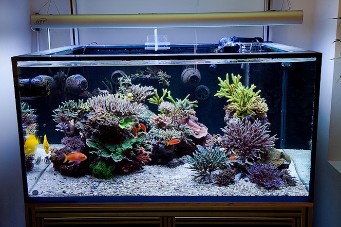
This beautiful tank of Adrian Moeller is a perfect example of creating a living picture by eliminating visual clutter from the sides and bottom of the tank, as well as using a large sand bed to emphasize the structure. Photo by Adrian Moeller.
Rule 2: A Mirror is not the best reflection
As humans, our brain has evolved to be a pattern recognition machine. Our alphabet, music and most visual cues are all centered around our ability to determine patterns. As a consequence we can very easily detect simple patterns, such as something divided down the middle, or symmetrically arranged. Having said that, we are also preprogrammed to automatically arrange things around us to give structure and order to our lives. In essence this translates to an unconscious drive to build things with symmetry. Knowing this upfront will help prevent you dropping into this simple trap and accidentally building something that clearly looks man made. Avoiding symmetry alone can make a huge difference in aquascaping; following the golden rule, detailed below will really help avoid this pitfall.
Rule 3. Avoid the bends
One stumbling block many people hit when scaping a tank is not allowing for refractive effects. Simply put, refraction is going to bend the path of light as it leaves the tank water/glass and enters the air before hitting our eyes. When it does this it acts like a lens and makes the contents of the tank appear closer. In actuality, refraction will compress the depth of the tank by about one third. Thus, a 2 foot deep tank will look 18 inches deep; a 3 foot tank will be compressed to an apparent 2 foot depth, and so on. Now, aside from the fact that refraction makes our expensive tank looks smaller, the main problem from a scaping perspective is that refraction only affects depth, not height or width. This means that any slope you create in the tank (such as an arch) will become compressed if it moves from front to back. This is a serious problem if you, as many people do, design a structure out of water. Once it goes into the tank a front facing slope will be compressed by 30%. So, a premade 45 degree slope becomes a 60 degree slope. Likewise, a 60 degree slope will resemble a shear wall. Knowing this upfront can save a lot of time when designing your scape. As a general rule of thumb, make slopes that run front to back as gradual as possible.
Rule 4. The correct ratio is Golden
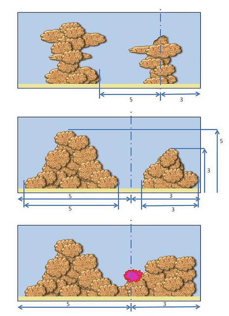
The Golden rule goes by a number of names, such as the golden rule, 5-3 rule, the golden ratio or the golden mean. Irrespective of the chosen name, the golden rule describes a very simple feature that is a constant throughout nature and science and is based on proven mathematical principles and, as such, is more than just a rule of thumb. As far as we are concerned it states that: Any two features when juxtaposed look most natural or harmonious when the ratio of their dimensions fits the golden rule. While this is a constant in nature, it has also been adopted by many human disciplines such as landscaping, architecture and photography and is a fundamental of virtually all visual based arts. The first people to really recognize the significance of the golden ratio were the ancient Greeks who described its properties in a mathematical form. In the 13th century an Italian mathematician went one step further and described an ascending series of numbers, the eponymously named Fibonacci series, where successive values are the sum of the previous two numbers. The first elements of the series are 1, 1, 2, 3, 5, 8, 13, 21, 34, 56 etc. The interesting thing about the higher numbers of this series is that if one were to divide successive numbers, the result is the Golden ratio every time. The two numbers 5 and 3 are often used to describe this since they are easy to remember and are the simplest combination that approximates to the golden ratio of 1.6.

When designing the aquascape of my current 600g tank I incorporated a single gully feature sited at the approximate 5/3 dividing line. In addition two coral island were incorporated with approximate 5/3 ratio. Additionally, the aquascaping by Adrian (shown above) also incorporates the 5/3 division of the coral islands. Photo by Paul Whitby.
Following the work of Fibonacci, artisans and mathematicians realized that sequential numbers of the Fibonacci series represented facets of geometry and natural structures and that the golden rule is a relative constant in nature. This was famously described by Leonardo DaVinci, who stated that bodily proportions exhibit the golden ratio (in fact many art critics speculate that the face of the Mona Lisa is constructed around this principle, explaining her enigmatic beauty). Aside from the work of Da Vinci, the golden ratio has been deliberately employed in a number of architectural structures such as the Taj Mahal, In nature, examples of the ratio can be seen in the arrangement of sunflower seeds, the growth of pine cones, the spacing between elements of our heart beat, crystal structures, flower petal arrangement, the segments of animal bodies and even the very structure of DNA. So to summarize, the golden ratio is seen everywhere and we have become so accustomed to it that anything following this ratio is automatically aesthetically pleasing to us. So- how can we utilize this peculiarity of math and nature to our advantage. Interestingly, there are a number of applications but all of them rely on the division of space into a 5-3 ratio. The simplest application is when choosing the placement of a “center piece” coral in an already scaped tank. Instead of adding at a central location, as the name would imply, divide the tank by an imaginary 5-3 ratio and site the coral as close to the dividing line as possible. If you can also do the same for its vertical spacing as well, the coral will be in the most ideal aesthetic position and will become the most noticed. This is a very common application seen in photography and painting. However the golden rule can be applied to much more. When planning the addition of a single feature to an empty tank- such as the negative space of a gully or canyon, position it off center such that it sits on the approximate 5-3 dividing line. If you are planning on adding multiple structures, work them to have an approximate 5-3 ratio in width and further emphasize this by applying the same ratio to height. If you are planning multiple structures such as rock islands, pillars and towers etc, initially figure where the key element would be (such as the largest or tallest piece), then divide the remaining space into 5-3 and site the center of the other one at this point. In the figure, a theoretical tank is divided into 5-3 segments to show all of the various applications of this simple rule. Choosing any of these easy-to-apply approaches will help create an aquascape that looks both natural (at least in composition) and ensure that symmetry is not inadvertently applied to your rock work.
 Please remember, the simple rules and ideas detailed above are approaches to aquascaping, and not absolutes you have to follow. Some are based on observation and some on accepted visual theory. Your tank is that: your tank and you should follow the approach that suits you best. I hope that the ideas I have discussed above stimulate thought and hopefully help you in a quest for the perfect look. In the next article I will look at the value of color theory and forced perspective as applied to marine biotopes.


0 Comments